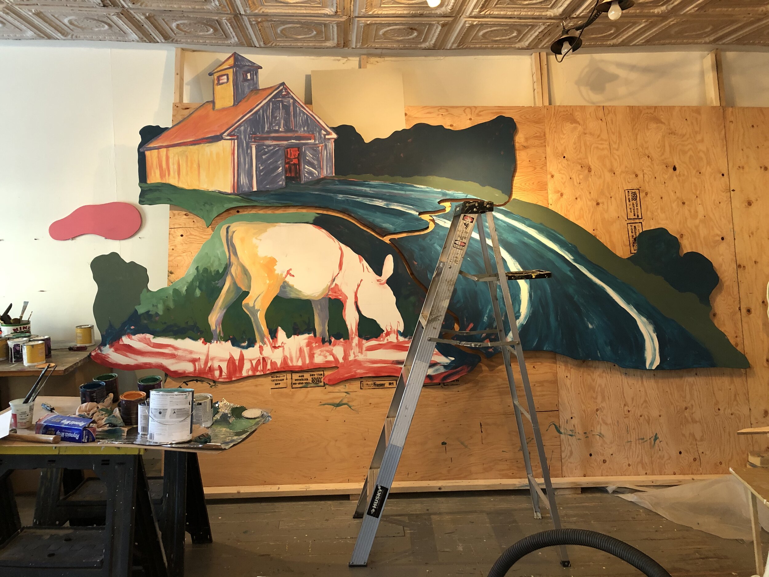
So this mural, the first of 7+ for this location, is well underway and I am nearing that point on this one of “Is it done?”. The good and the bad of a project being approved upon a concept drawing is that not all of the details are worked out from the start and that allows for more to happen and evolve as the work progresses and truthfully I enjoy this way of working, letting the painting speak to me and allowing it to surprise me. I am working with another Maine Artist on this project and we each are working on separate mural panels and that too has its own challenges in that we hope and trust they will all work as a cohesive whole in the end.
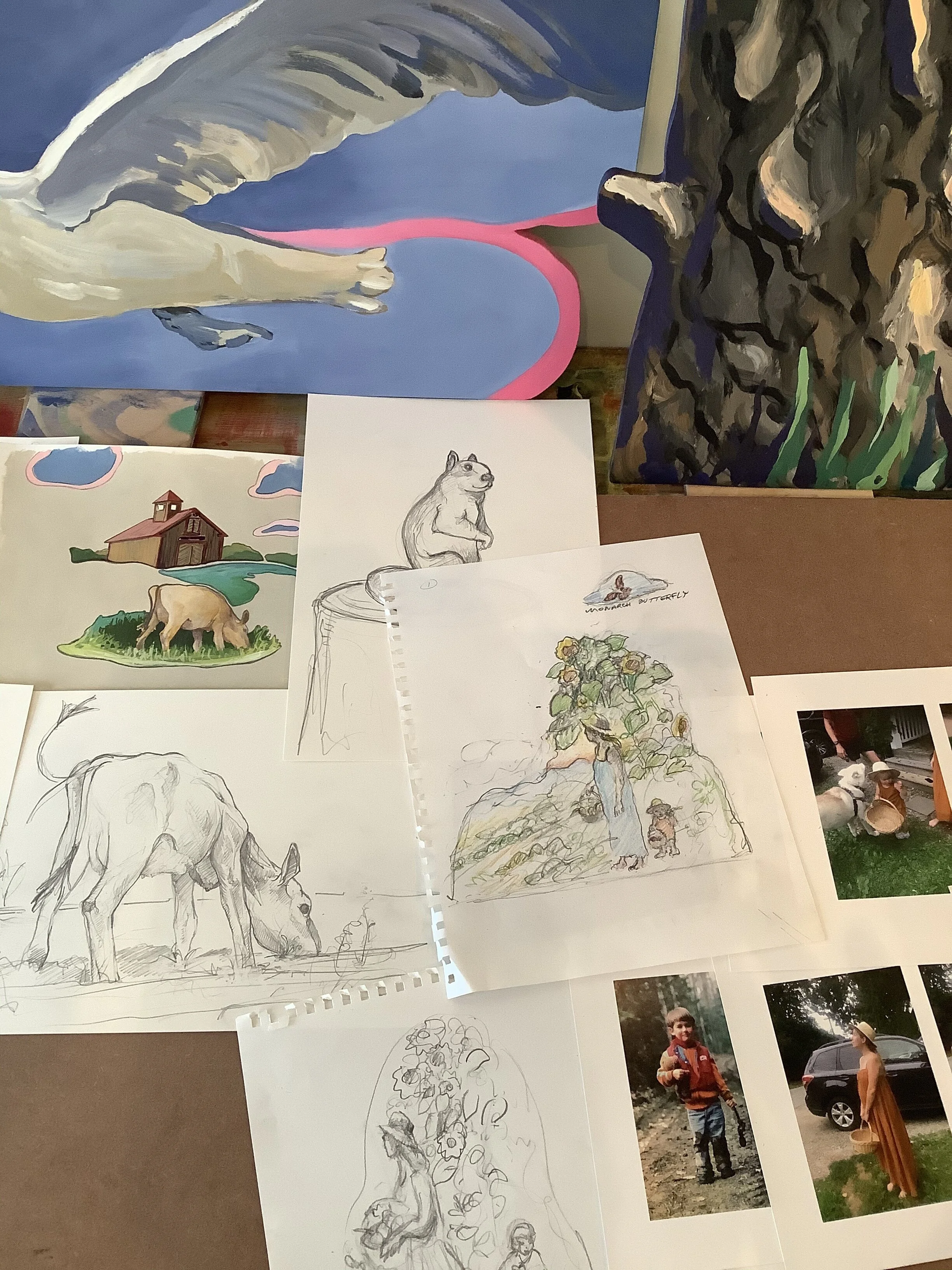
Photo from the presentation showing sketches, drawings, and images from both of us. You can see the Cow/barn scene immediately changed in composition due to a change of location for it in the building which added more wall space and its need to become larger.
As will all large projects problem solving is required and the painting on shaped panels, each from a 4’x8’ sheet of plywood, would drive the compositions. For mine I choose to look at children’s books and puzzles for I inspiration and how the panels would “work” together. I was really pleased how the cuts of each panel need up and that they would add to the overall visual composition. To fill the longer than originally planned wall for this piece I added an extra panel that created a path leading the viewer back t the barn- A welcome change that only solidified the overall composition.
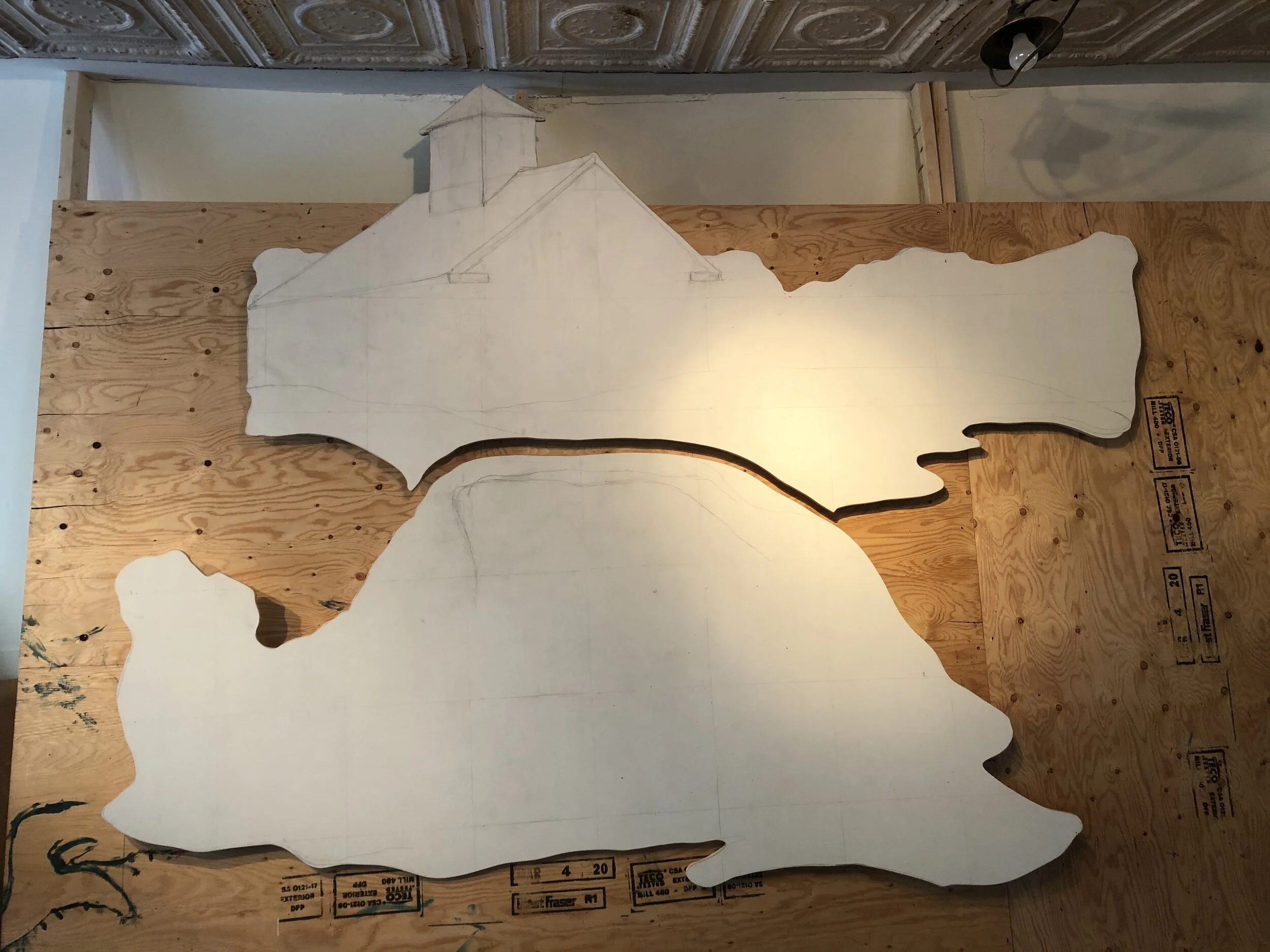
Original plan for 2 large panels with cow in foreground and barn in back.
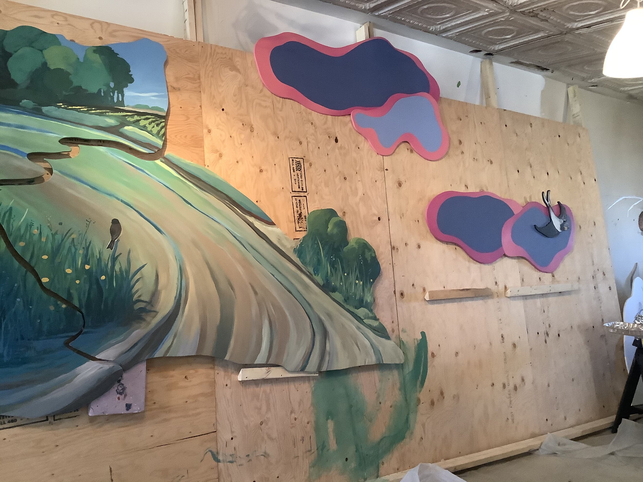
Adding the third panel really juiced the composition and helped solidify the “story”.
I used a light grid method to transfer the basic elements of the composition guiding my panel cutting. Then roughing in the major elements in a red/pink hue allows for some color play to occur knowing that my final piece would be primarily a lush green palette- Summer in Maine. I wanted to have some of the underpainting show through and activate the green palette. Overall values and composition are worked out here so that I can then focus on color and mark making, as I wanted rich and intense color to dominate the feeling of the work. I am always fascinated by the act of communicating a feeling I have when I am out and about in nature. For me color transfers this intense feelings I experience and I believe for the children and adults viewing this work that they can become more engaged with the Artwork.
To lighten the work and push it towards that children’s book feel I used stylized clouds to define the sky. I have been fascinated by the backlit clouds and the play of color when you really look closely at them. Of course I exaggerated the colors and design and these purples and pinks became the “clouds” and places to add owls and birds.
The clouds lighten the work and a swift projects off the last cloud and mingles with the next panel painted by my mural partner- A close up scene of three children, hay bails, and chickens.
Getting close!
I think it is done, but will leave the panels up for 2 more weeks as I plan my panel cuts for the next scene- This time a water view with lakes, mountains, canoes, and trees. I am pleased with the overall palette and the sense of depth I have created. Feeling as though one could walk back into the composition and enter the barn was important and the bit of underpainting in the barn interior I feel glows and invites one in. In the end I did not wish to make “Children’s Art” with this mural but ART for Children!


