Collaborating is never easy, but always productive in the end- Whether the project is successful that is another story that only time can tell.
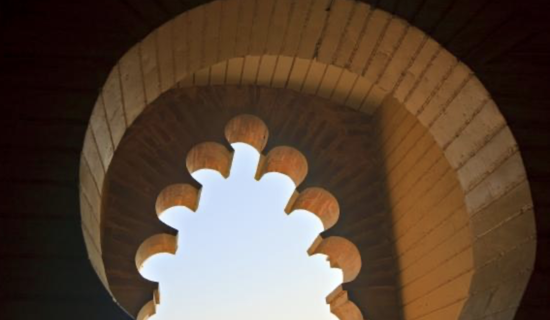
This large scale residential collaboration involves a 12’ w landscape painting on gilt metal leaf panels, which we will talk about in another post, and the frame that holds-ties it all together. The client is infatuated with Moroccan architecture and culture and in the end her cookbooks were especially useful in finding out what it was she loved about the particular designs and imagery. We also email often and she would send imagery that she reacts to- Sometimes in the most organized packets via the mail. In non-Covid times we would do more personal one-on-one meetings and I do miss that as the ability to understand the clients wishes and get “into her head” is difficult via the internet and a much slower process. Four months into the project and in the midst of working out the frame details I felt it necessary to build a test frame to understand some of the nuances of the overall design. I used the image above to begin, although in the end it was not quite correct in the clients eyes as the overtly circular designs were not favorable and too much of the painting was hidden. The image below was the initial “curtain idea, but lacked something and was not quite right.
Curtain design idea attempted with the frame maker that lacked the desired effect,
First pass at the opening based on the top Moroccan Arch image that I used for inspiration.
The face of the frame was to also be indicative of Moroccan architecture. . .. Pattern on pattern, on pattern. .. . . . I use a raised stencil technique and am drawing out designs here to see if it works.
The use of stencils in my work is one I have worked to advance over the years. I can and do carve wood at times, but the raised stencil to me is more “hand” made and an extension of my love of drawing + painting. I tend to draw quickly and loosely my designs and then allow the stencil cutting to be loose and free, not trying to copy those drawings lines- They are only guides for the final stencil pattern.
Stencils can by Kitsch for sure, but used as a tool with other tools it can become part of a process that is I feel has wonderful possibilities!
First pass at cut out “curtain” frame with applied raised plaster stencil design.
In building this mock-up I worked quick and loose (Pretty much finished the frame in one day). I did not want to get tied up in construction methods as that can be solved later and would only hamper the creative process. This was a 3-d sketch of the frame- I applied raised plaster designs as well as wood fillers to create interesting edges allowing areas of the frame to sit proud of one another or recede. All of this was to allow for the final metallic glazed finish to have extraordinary details through a rub-off process. See the image below for final finish.
Layers of metallic copper were buried under a rich dark glaze and revealed as necessary.
In the end the circular based opening was not the right direction, but the overall feel was on track minus a few things here and there. The two medallions were not a hit, but I admit they were a bit clunky and did not translate well. As in all sketches some things can and will be taken to the next level and some will be discarded and that is okay.
I will discuss the final drawings for the openings and that process soon in another post as I am still working closely with the woodworker on the details- I will say that as I hit “publish” on this post the frame with its approved openings has been completed and will be delivered today! Yay!


